First Date Games
Princess Nail Art
Indulge in the relaxing world of Princess Nail Art, where creativity and relaxation meet.
▶ Play nowBecome the manicurist every client asks for. This Nail Salon Sim guide covers color theory, shape, gems and glitter, seasonal themes, and the client-matching mistakes that turn a great design into a so-so one.
Home / Guides / Nail Salon Game Guide: How to Create Stunning Nail Art Every Time
In Nail Salon Sim you play a master manicurist. Each round gives you a client — sometimes with a specific request, sometimes with an open brief — and a full salon toolkit: nail shapes, base colors, gradients, glitter, gems, stickers, and accessories. You shape the nails, paint them, decorate them, and finish with a top coat.
There is no fail state and no timer pressuring you in most rounds, which is exactly why the difference between an average set and a stunning set is taste, not speed. The game rewards designs that look deliberate: colors that belong together, decoration that has a focal point, and a finish that suits the client's style. This guide teaches you how to make every set look deliberate, even when you are starting from a blank nail.
Think of each manicure as a tiny composition. You are not just picking a pretty color — you are choosing a shape, a palette, a focal point, and a finish that all tell the same story. When those four choices agree, the result looks professional. When they disagree, even expensive-looking gems cannot save it.
The most common beginner mistake is treating the salon like a toy box: a bit of glitter here, a gem there, a sticker on every nail, three clashing colors because each one looked nice on its own. The result is busy rather than beautiful — the eye has nowhere to rest, and the design reads as 'a lot of stuff' instead of a look.
The second mistake is the opposite: playing it too safe. One flat color, no decoration, no variation between nails. It is clean, but it is forgettable, and it wastes the tools the game gives you. A great manicure lives between these two extremes: one clear idea, executed with restraint, plus one moment of drama.
The third mistake is ignoring the client. When a round gives you a brief — a wedding, a party, a seasonal event, a character with a strong personal style — styling against it is the fastest way to a design that feels wrong even if the individual pieces are pretty. The brief is not a restriction; it is the theme that makes your choices easy, because it tells you which colors and decorations belong.
Every great nail design starts with a palette of two or three colors that already get along. The simplest reliable palettes are: monochrome (one color in different shades, like pale pink, rose, and deep berry), analogous (neighbours on the color wheel, like lilac, violet, and blue), and complementary accents (a calm base with one opposite-color pop, like nude nails with a single emerald accent).
Borrowed from interior design, it works beautifully on nails: about 60% of the look is your main color, 30% is a supporting shade, and 10% is the accent — the glitter, the gem, the one bold nail. When decoration stays inside that 10%, it reads as intentional sparkle. When it creeps past 30%, it reads as clutter.
Soft pastels and nudes suit weddings, school looks, and everyday elegance. Deep jewel tones — emerald, sapphire, burgundy — suit evening and winter themes. Bright neons and candy colors suit parties and summer. Metallics (gold, silver, rose gold) are the universal finish: they warm up almost any palette, which is why a thin gold line or a single gold gem can rescue a design that feels flat.
Once the basics are automatic, the leap from good to great is thematic thinking. A seasonal set tells a story: spring means pastels with a single floral accent; summer means bright corals and fruit tones; autumn means deep burgundy and gold leaf; winter means icy blues, silver glitter, and snowflake details. Playing inside a season narrows your choices, and narrow choices are easier to make beautiful.
When the client is a specific character — a pop idol, a princess, a bride, a Halloween party-goer — steal one element from their outfit and repeat it on the nails. A bride's veil becomes white lace detailing; an idol's stage costume becomes a metallic accent nail; a Halloween client gets one black nail with a tiny pumpkin. One echo is enough to make the whole look feel designed rather than random.
Every strong stylist has a recognizable touch: a perfect French tip, a signature glitter fade, a tiny gem placed exactly at the cuticle. Pick one technique, practice it until it is flawless, and use it as your default 'finish' — the thing that makes even a simple set unmistakably yours. Clients remember the detail; the game rewards the consistency.
Improvement in a styling game is not about doing more rounds — it is about doing rounds with intent. Before each set, say the idea out loud in one sentence: 'elegant winter bride, icy blue with silver snowflakes' or 'bold summer party, coral with one gold accent.' If you cannot say it in one sentence, you do not have an idea yet — you have a pile of options. Choose the idea first, and the tools choose themselves.
After each set, review it with three questions: is there one clear focal point? Do the colors belong in the same family? Does the design fit the brief? Score yourself honestly, and keep a mental gallery of your best three sets — the palettes and focal points you keep returning to are the start of your personal style. Within a week of deliberate practice, you will find you stop browsing every option and start reaching straight for the right one. That is the moment the game stops being a toy box and starts being a craft.
What is the best nail shape for beginners?
Almond or oval. Both are elegant, suit almost every design, and make colors and decoration look balanced. Square is bolder and better for modern looks, while stiletto is dramatic — save it for statement designs once you are confident with placement.
How many colors should I use in one manicure?
Two or three, chosen as a palette. One main color (about 60% of the look), one supporting shade (30%), and one accent (10%) is the most reliable formula. Four or five unrelated colors almost always clash, even if each one is pretty on its own.
Should I decorate every nail?
No — decorate one or two accent nails (usually the ring fingers) and keep the rest clean. A single focal point gives the eye somewhere to rest and makes the design look professional; decorating all ten nails usually reads as clutter.
How do I match nails to a client or occasion?
Start from the brief: a wedding wants soft pastels and nudes, a party wants brights and glitter, winter wants deep jewel tones and metallics. Then steal one detail from the client's outfit — a color, a motif — and repeat it on the nails so the whole look feels coordinated.
What is the 60-30-10 rule?
A simple proportion for any design: 60% main color, 30% supporting shade, 10% accent (glitter, gems, or a bold nail). It keeps decoration intentional — sparkle stays inside the 10%, so the design looks polished instead of busy.
How can I make my nail art look more professional?
Three habits: keep one clear focal point, keep all colors in the same warm or cool family, and always finish with a top coat so glitter and gems sit in one polished surface. Review the whole hand before finishing — and remove one element rather than adding another if it feels busy.
Indulge in the relaxing world of Princess Nail Art, where creativity and relaxation meet.
▶ Play now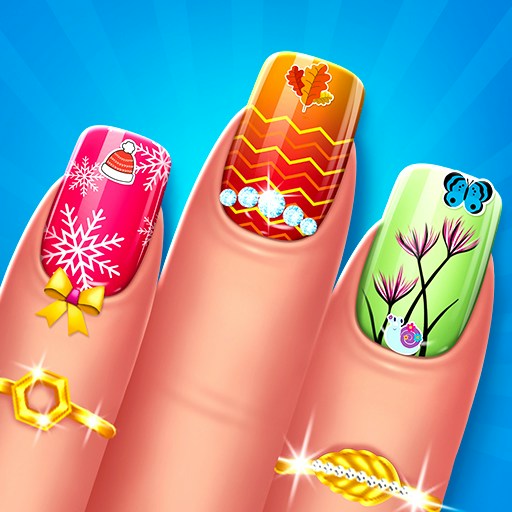
Unleash your creativity in All Seasons Nail Salon, where you transform nails into stunning works of art.
▶ Play now
In K-Pop Demon Hunters Nail Studio, unleash creativity by designing stylish nails for idol-turned-demon slayers.
▶ Play now